community_charts
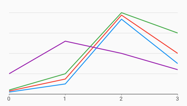
Line Disjoint Axis Axes Example

Example:
/// Example of using disjoint measure axes to render 4 series of lines with
/// separate scales. The general use case for this type of chart is to show
/// differences in the trends of the data, without comparing their absolute
/// values.
///
/// Disjoint measure axes will be used to scale the series associated with them,
/// but they will not render any tick elements on either side of the chart.
import 'package:community_charts_flutter/flutter.dart' as charts;
import 'package:flutter/material.dart';

class DisjointMeasureAxisLineChart extends StatelessWidget {
  final List<charts.Series> seriesList;
  final bool animate;

  DisjointMeasureAxisLineChart(this.seriesList, {this.animate});

  /// Creates a [LineChart] with sample data and no transition.
  factory DisjointMeasureAxisLineChart.withSampleData() {
    return new DisjointMeasureAxisLineChart(
      _createSampleData(),
      // Disable animations for image tests.
      animate: false,
    );
  }


  @override
  Widget build(BuildContext context) {
    return new charts.LineChart(seriesList,
        animate: animate,
        // Configure a primary measure axis that will render gridlines across
        // the chart. This axis uses fake ticks with no labels to ensure that we
        // get 5 grid lines.
        //
        // We do this because disjoint measure axes do not draw any tick
        // elements on the chart.
        primaryMeasureAxis: new charts.NumericAxisSpec(
            tickProviderSpec: new charts.StaticNumericTickProviderSpec(
          // Create the ticks to be used the domain axis.
          <charts.TickSpec<num>>[
            new charts.TickSpec(0, label: ''),
            new charts.TickSpec(1, label: ''),
            new charts.TickSpec(2, label: ''),
            new charts.TickSpec(3, label: ''),
            new charts.TickSpec(4, label: ''),
          ],
        )),
        // Create one disjoint measure axis per series on the chart.
        //
        // Disjoint measure axes will be used to scale the rendered data,
        // without drawing any tick elements on either side of the chart.
        disjointMeasureAxes:
            new LinkedHashMap<String, charts.NumericAxisSpec>.from({
          'axis 1': new charts.NumericAxisSpec(),
          'axis 2': new charts.NumericAxisSpec(),
          'axis 3': new charts.NumericAxisSpec(),
          'axis 4': new charts.NumericAxisSpec(),
        }));
  }

  /// Create one series with sample hard coded data.
  static List<charts.Series<LinearClicks, int>> _createSampleData() {
    // The first three series contain similar data with different magnitudes.
    // This demonstrates the ability to graph the trends in each series relative
    // to each other, without the largest magnitude series compressing the
    // smallest.
    final myFakeDesktopData = [
      new LinearClicks(0, clickCount: 25),
      new LinearClicks(1, clickCount: 125),
      new LinearClicks(2, clickCount: 920),
      new LinearClicks(3, clickCount: 375),
    ];

    final myFakeTabletData = [
      new LinearClicks(0, clickCount: 375),
      new LinearClicks(1, clickCount: 1850),
      new LinearClicks(2, clickCount: 9700),
      new LinearClicks(3, clickCount: 5000),
    ];

    final myFakeMobileData = [
      new LinearClicks(0, clickCount: 5000),
      new LinearClicks(1, clickCount: 25000),
      new LinearClicks(2, clickCount: 100000),
      new LinearClicks(3, clickCount: 75000),
    ];

    // The fourth series renders with decimal values, representing a very
    // different sort ratio-based data. If this was on the same axis as any of
    // the other series, it would be squashed near zero.
    final myFakeClickRateData = [
      new LinearClicks(0, clickRate: .25),
      new LinearClicks(1, clickRate: .65),
      new LinearClicks(2, clickRate: .50),
      new LinearClicks(3, clickRate: .30),
    ];

    return [
      // We render an empty series on the primary measure axis to ensure that
      // the axis itself gets rendered. This helps us draw the gridlines on the
      // chart.
      new charts.Series<LinearClicks, int>(
          id: 'Fake Series',
          domainFn: (LinearClicks clickCount, _) => clickCount.year,
          measureFn: (LinearClicks clickCount, _) => clickCount.clickCount,
          data: []),
      new charts.Series<LinearClicks, int>(
        id: 'Desktop',
        colorFn: (_, __) => charts.MaterialPalette.blue.shadeDefault,
        domainFn: (LinearClicks clickCount, _) => clickCount.year,
        measureFn: (LinearClicks clickCount, _) => clickCount.clickCount,
        data: myFakeDesktopData,
      )
        // Set the 'Desktop' series to use a disjoint axis.
        ..setAttribute(charts.measureAxisIdKey, 'axis 1'),
      new charts.Series<LinearClicks, int>(
        id: 'Tablet',
        colorFn: (_, __) => charts.MaterialPalette.red.shadeDefault,
        domainFn: (LinearClicks clickCount, _) => clickCount.year,
        measureFn: (LinearClicks clickCount, _) => clickCount.clickCount,
        data: myFakeTabletData,
      )
        // Set the 'Tablet' series to use a disjoint axis.
        ..setAttribute(charts.measureAxisIdKey, 'axis 2'),
      new charts.Series<LinearClicks, int>(
        id: 'Mobile',
        colorFn: (_, __) => charts.MaterialPalette.green.shadeDefault,
        domainFn: (LinearClicks clickCount, _) => clickCount.year,
        measureFn: (LinearClicks clickCount, _) => clickCount.clickCount,
        data: myFakeMobileData,
      )
        // Set the 'Mobile' series to use a disjoint axis.
        ..setAttribute(charts.measureAxisIdKey, 'axis 3'),
      new charts.Series<LinearClicks, int>(
        id: 'Click Rate',
        colorFn: (_, __) => charts.MaterialPalette.purple.shadeDefault,
        domainFn: (LinearClicks clickCount, _) => clickCount.year,
        measureFn: (LinearClicks clickCount, _) => clickCount.clickRate,
        data: myFakeClickRateData,
      )
        // Set the 'Click Rate' series to use a disjoint axis.
        ..setAttribute(charts.measureAxisIdKey, 'axis 4'),
    ];
  }
}

/// Sample linear data type.
class LinearClicks {
  final int year;
  final int clickCount;
  final double clickRate;

  LinearClicks(this.year, {this.clickCount = null, this.clickRate = null});
}